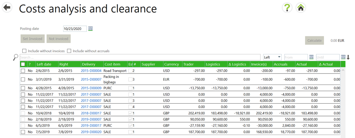
The Cost analysis and clearance screen shows information about individual cost items similar to what is shown in the cost analysis section of the financial tab of the delivery form. Here you can easily find cases where the actual costs deviate from the budgeted costs, select multiple items and mark the selected group as invoiced.
The design of the screen uses a standard Agiblocks table. In it, information from a Delivery Financial tab cost analysis sections are displayed with one cost item per line. You can change the width of the columns.

To easily focus on the cost items that usually need to be marked as invoiced, the screen has 2 default filters:
1. It shows only cost items that have a non-zero balance of invoice allocations
2. It shows only cost items that have a non-zero balance of accruals
The result is that the screen shows only those items with a cost that is invoiced with a remaining accrual.
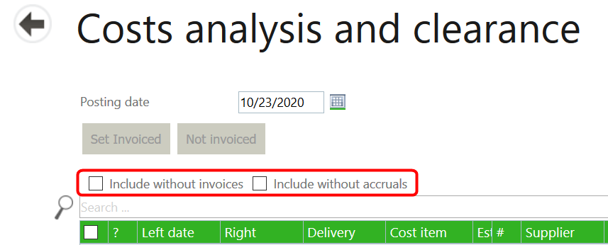
At the top left of the table you see 2 check boxes to override these defaults:

| • | You can include cost items without invoices (short for items with a zero invoice balance) |
| • | You can include cost items without accruals (short for items with a zero accruals balance) |
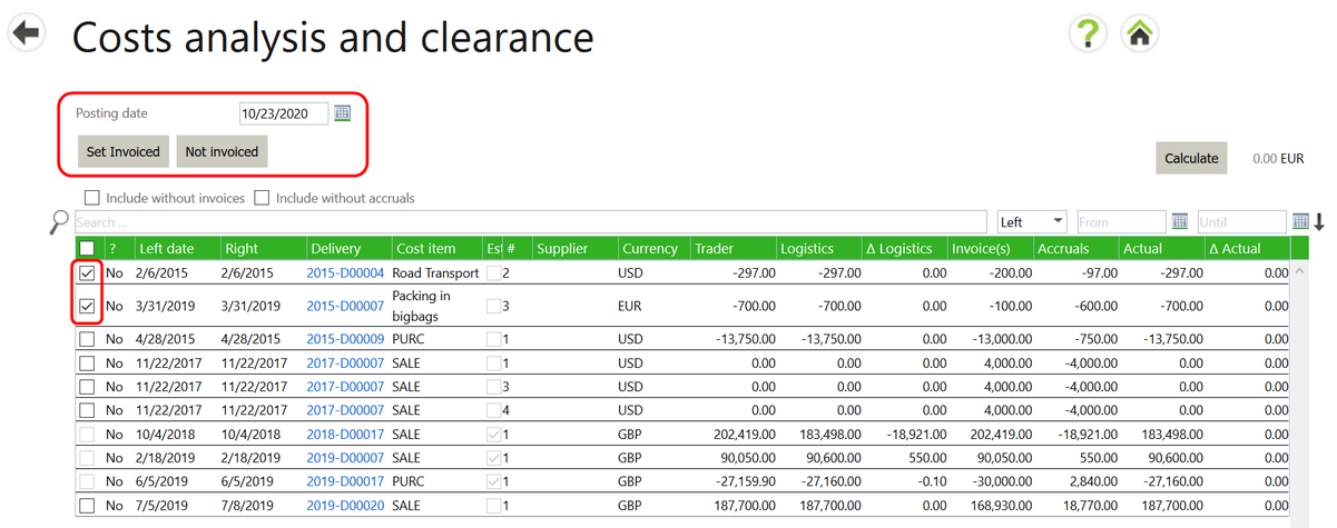
At the top of the screen there is a field to enter a posting date and 2 buttons to collectively mark selected items as invoiced or not invoiced as per that date. Selecting one or more items in the check box on the left in the table activates the buttons and allows you to select them.
By default, the screen will show about 75 lines. If you select the check box in the table header, it will load all cost items that match the filter criteria.

The following information is displayed in each column in the table:
| • | ? – Is the cost item invoiced, yes or no. |
| • | Left date – Execution date of the left side of a delivery. |
| • | Right date – Execution date of the right side of a delivery. |
| • | Delivery – Delivery number. |
| • | Cost item – Name of the cost item. |
| • | # - Cost item number in the cost sheet of the delivery. |
| • | Supplier – Supplier name. |
| • | Currency – Original currency of the cost item Note: Cost items on this screen are not converted to “company currency" and are displayed in their original currency values. |
The following column information should be visible on a delivery cost sheet – cost analysis section
| • | Trader – Trader’s budget |
| • | Logistics – Logistics budget |
| • | ΔLogistics - Delta of Trader budget vs logistic budget |
| • | Invoices(s) – Total invoiced |
| • | Accruals – Total accrued |
| • | Actual – Sum of invoice(s) and accruals |
| • | ΔActual – Delta of logistic budget total minus actual budget total |